NuboCoder – Beaver Builder Carousel
A drag-and-drop carousel module for Beaver Builder, powered by the Slick Carousel library. This guide covers every setting the module exposes, all three ways to build slides, and how to troubleshoot the common issues.
On this page
1Overview
NuboCoder – Beaver Builder Carousel adds a fully customizable carousel/slider module to the Beaver Builder page builder, powered by the well-known Slick Carousel JavaScript library.
- Drag-and-drop module inside Beaver Builder — no code required for basic use.
- Fine-grained control over autoplay, arrows, dots, speed, easing, center mode, and more.
- Responsive breakpoints — change any carousel setting at specific browser widths, or disable the carousel entirely below a given width.
- Three ways to populate slides: build items manually with an image, rich text and an optional link; paste raw, sanitized HTML per item; or populate a single item — or the entire carousel — from a WordPress shortcode.
- Install and activate the plugin (Installation).
- Drag the Carousel module onto a page from the NuboCoder category (Adding the module).
- Add one or more items on the Items tab (Items) — the simplest option is an image plus some text.
- Tweak Autoplay, Arrows and Dots on the General tab to taste, and hit Save.
2Requirements & compatibility
| Requirement | Version |
|---|---|
| WordPress | 3.0.1 or later (tested up to 7.1.2) |
| Beaver Builder | Standard, Pro, or Agency — the module only uses standard, publicly-documented Beaver Builder APIs, so all three tiers work identically. Explicitly tested against Beaver Builder Pro 2.7.4.2 through 2.11.1. |
| PHP | No specific minimum — whatever your WordPress install already requires is sufficient. |
The module registers itself automatically once both Beaver Builder and this plugin are active — no separate configuration screen is needed.
3Installation
- Upload the
nubocoder-bb-carouselfolder to/wp-content/plugins/, or install the plugin ZIP from Plugins → Add Plugin → Upload Plugin in your WordPress admin. - Activate the plugin through the Plugins menu.
- That's it — the Carousel module now appears inside the Beaver Builder editor, under the NuboCoder category.

4Adding the module to a page
Open any page in Beaver Builder, click the + icon to open the modules panel, and search for "Carousel." You'll find it listed under the NuboCoder category — a second result, "Posts Carousel," is a different, built-in Beaver Builder module, so make sure you pick the NuboCoder one.
Drag it onto your page like any other module.
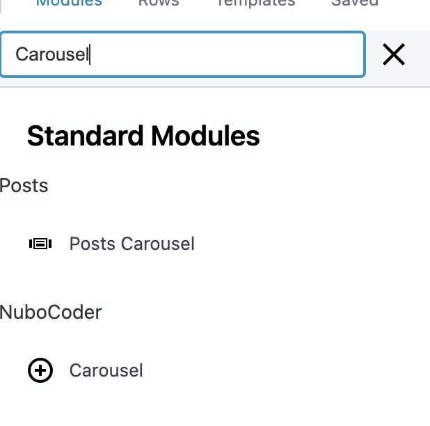
Once placed, double-click the module (or use its wrench icon) to open its settings panel, which has four tabs: General, Responsive, Items, and Advanced — the last one is Beaver Builder's standard spacing/visibility/animation panel, common to every module, and isn't covered here.
5General settings
5.1 Main
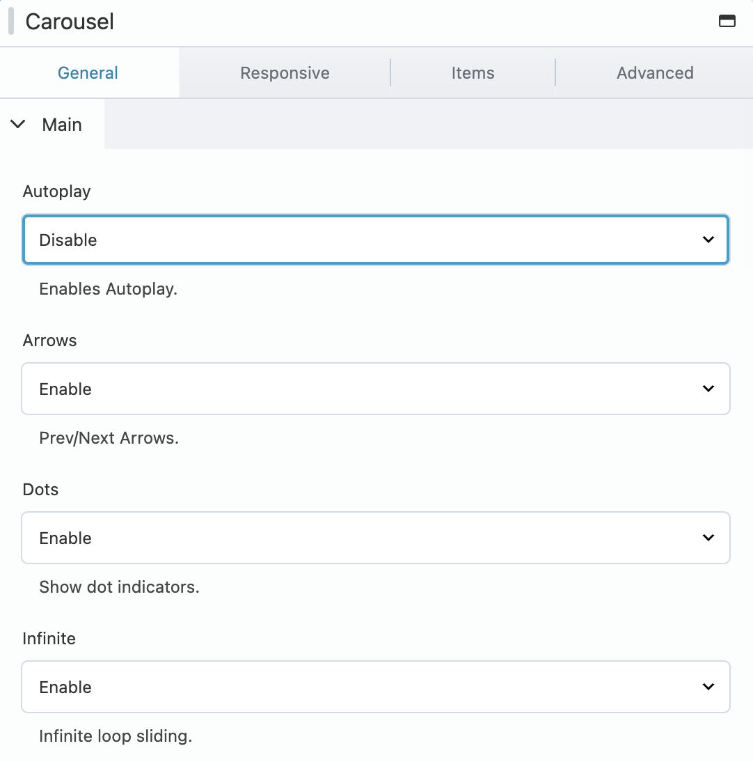
| Setting | Options | Default | What it does |
|---|---|---|---|
| Autoplay | Enable / Disable | Disable | Automatically advances slides. Reveals Autoplay Speed when enabled. |
| Autoplay Speed | Milliseconds | 3000 | How long each slide is shown before autoplay advances. |
| Arrows | Enable / Disable | Enable | Shows the Prev/Next navigation arrows. |
| Dots | Enable / Disable | Disable | Shows the row of dot indicators below the carousel. |
| Infinite | Enable / Disable | Enable | Loops back to the first slide after the last one, instead of stopping. |
| Pause On Focus | Enable / Disable | Enable | Pauses autoplay while a slide has keyboard focus (accessibility). |
| Pause On Hover | Enable / Disable | Enable | Pauses autoplay while the mouse is hovering the carousel. |
| Pause On Dots Hover | Enable / Disable | Disable | Pauses autoplay while hovering a dot indicator. |
| Rows | Number | 1 | Set above 1 to enable Slick's "grid mode" (multiple rows of slides per view). |
| Slides Per Row | Number | 1 | In grid mode, how many slides sit in each row. |
| Slides To Show | Number | 1 | How many slides are visible at once. |
| Slides To Scroll | Number | 1 | How many slides move per navigation action. |
| Speed | Milliseconds | 300 | The slide/fade transition animation speed. |
Slides To Show and Slides To Scroll are the two settings you'll adjust most often for a typical logo strip or product-card carousel — for example, Slides To Show: 4 with Slides To Scroll: 1 gives a smooth, one-at-a-time scroll through four visible cards.
5.2 Additional
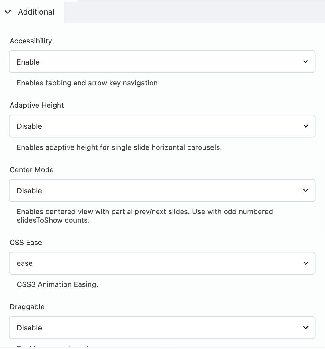
| Setting | Options | Default | What it does |
|---|---|---|---|
| Accessibility | Enable / Disable | Enable | Enables tabbing and arrow-key navigation between slides. |
| Adaptive Height | Enable / Disable | Disable | Resizes the carousel's height to match the current slide (best with Slides To Show: 1). |
| Center Mode | Enable / Disable | Disable | Centers the active slide and shows partial glimpses of the previous/next slide. Reveals Center Padding when enabled. Works best with an odd Slides To Show value (1, 3, 5…). |
| Center Padding | Number + unit (px or %) | 50px | The side padding used in Center Mode — how much of the neighboring slides peek in from each edge. |
| CSS Ease | linear / ease / ease-in / ease-out / ease-in-out / step-start / step-end | ease | The CSS3 timing function used for the slide transition. |
| Draggable | Enable / Disable | Disable | Lets desktop users click-and-drag slides, in addition to touch swipe. |
| Fade (labeled "Dade" in the plugin) | Enable / Disable | Disable | Crossfades between slides instead of sliding them horizontally. Best used with Slides To Show: 1. |
| Focus On Select | Enable / Disable | Disable | Clicking a partially visible slide (e.g. in Center Mode) brings it into focus. |
| Lazy Load | ondemand / progressive | ondemand | Controls how slide images are lazy-loaded — ondemand loads just before a slide is shown, progressive loads slides in the background after the first render. |
| Swipe | Enable / Disable | Enable | Enables touch/swipe gestures on mobile and touch-screen devices. |
| Variable Width | Enable / Disable | Disable | Allows each slide to keep its own natural width instead of a uniform size. |
| Vertical | Enable / Disable | Disable | Switches the carousel to a vertical (top-to-bottom) layout. |
| Vertical Swiping | Enable / Disable | Disable | Changes swipe gestures to vertical when Vertical is enabled. |
| Z Index | Number | 1000 | The stacking order applied to slides — mainly relevant on older browsers (IE9 and below). |
6Responsive settings (breakpoints)
The Responsive tab lets you override any of the General settings above at specific browser widths — for example, disabling arrows on mobile, or showing 1 slide instead of 4 on tablets.
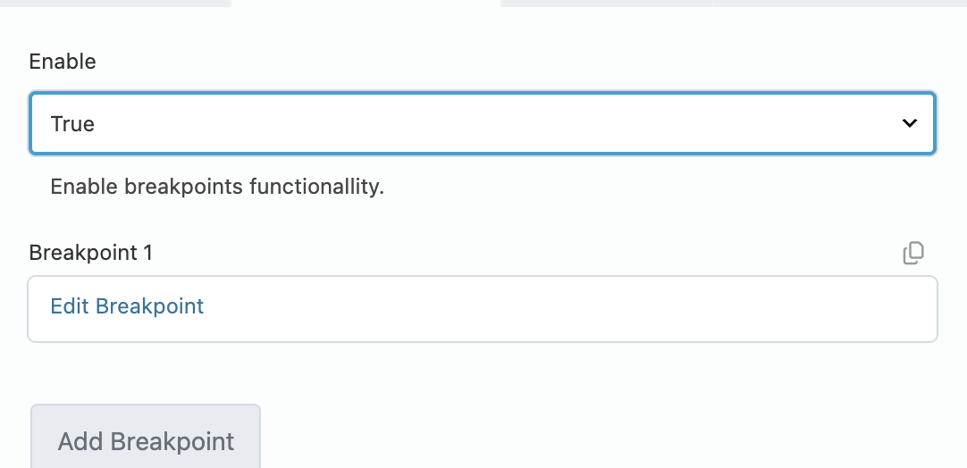
- Set Enable to True.
- Click Add Breakpoint (or Edit Breakpoint on an existing one).
- Fill in the breakpoint form.
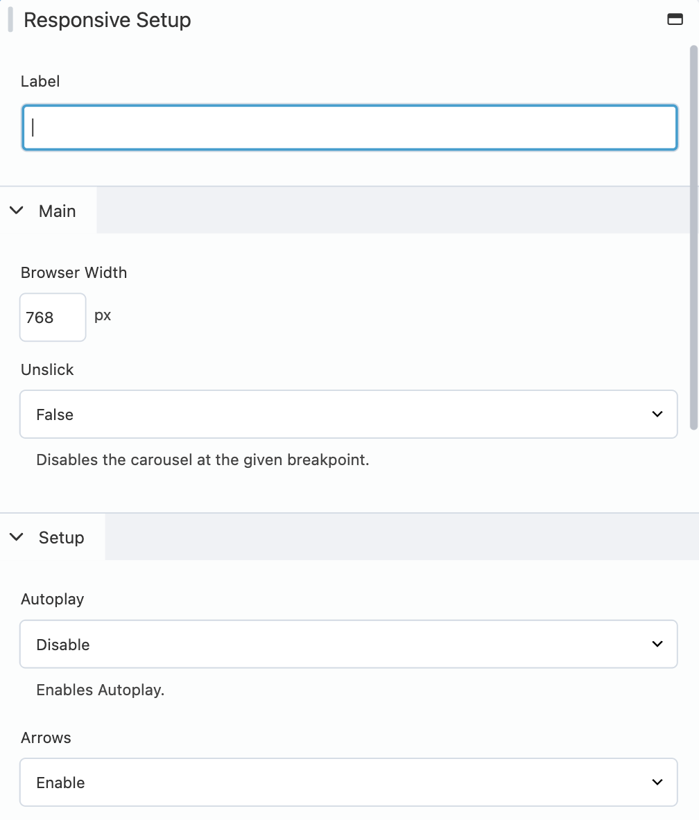
| Field | What it does |
|---|---|
| Label | An internal name shown in the breakpoint list — purely for your own reference. |
| Browser Width | The screen width, in pixels, this breakpoint applies at and below. |
| Unslick | True completely disables the carousel below this width (the slides just stack normally). False instead overrides individual settings for that width, via the Setup section that appears. |
| Setup section (when Unslick is False) | The same Autoplay/Arrows/Dots/Infinite/Rows/Slides Per Row/Slides To Show/Slides To Scroll/Speed settings from Main settings, scoped to this breakpoint only. |
You can add as many breakpoints as you need by clicking Add Breakpoint again. Slick applies the narrowest matching breakpoint, so list them in the order that makes sense for your layout — largest width to smallest is the easiest to reason about.
7Items — building your slides
The Items tab controls what actually appears inside the carousel.
7.1 Items type: default vs. shortcode
At the top of the Items tab, Items Type decides where your slides come from:
- Default — you build a list of items directly inside this panel. This is what most users will use.
- Shortcode — the entire carousel's content is generated by a single WordPress shortcode you provide instead. Use this when your slides come from a dynamic source: a custom loop, an external feed, a shared shortcode used elsewhere on your site.
With Items Type set to Default, you'll see a repeatable list of items:
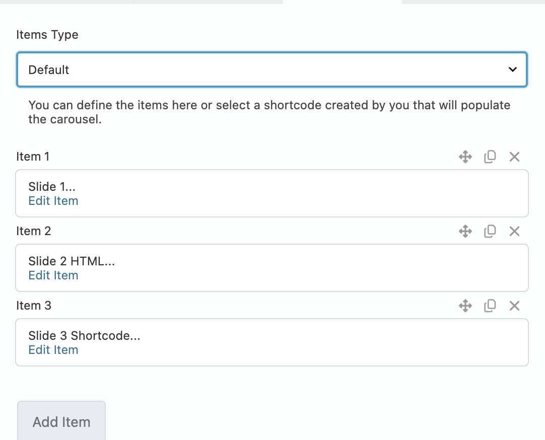
Click Add Item to add a new slide, or Edit Item on an existing one to configure it. Each item has its own Type dropdown — Default, Custom HTML, or Shortcode.
Switching Items Type to Shortcode instead replaces that list with a single Shortcode field, where you type the shortcode responsible for the whole carousel:
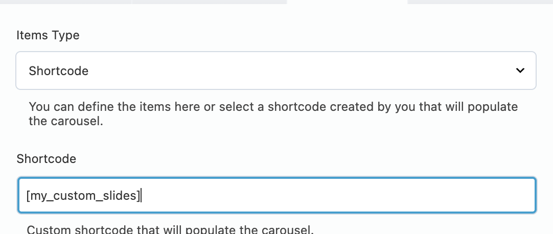
See Using shortcodes to populate the carousel for exactly what that shortcode needs to output.
7.2 Item type: default
The Default item type is the module's built-in slide layout: an optional image, rich-text content, an optional title (taken from the item's Label), and an optional link.
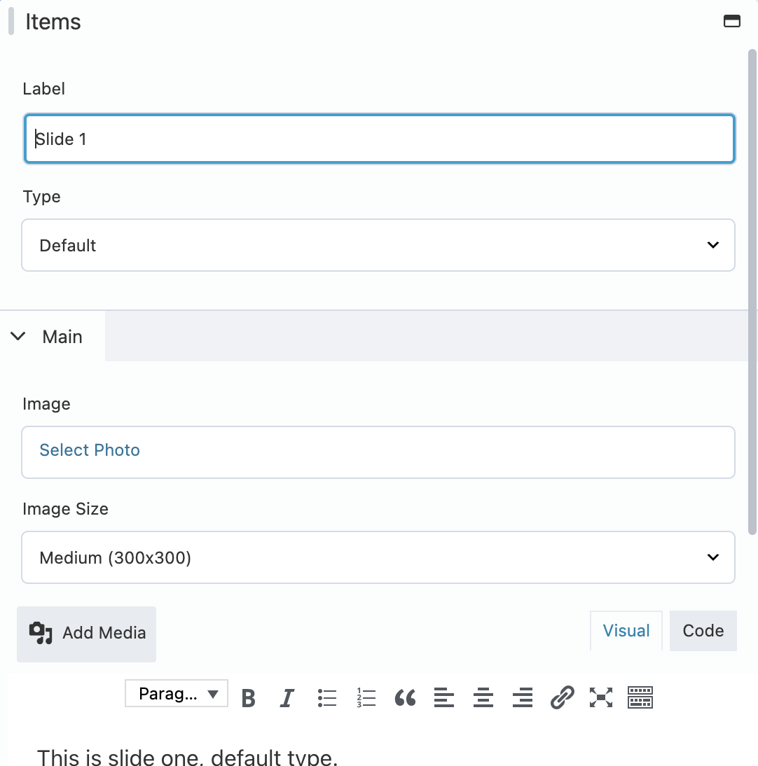
| Field | What it does |
|---|---|
| Label | Doubles as both the item's name in the builder list and the slide's on-screen title (rendered as an <h3>) if not empty. Leave it blank if you don't want a visible title. |
| Type | Set to Default for this layout. |
| Image | Pick an image from the Media Library. |
| Image Size | Which registered WordPress image size to use (Thumbnail, Medium, Large, Full, etc.). |
| Content | A full rich-text editor (bold, links, lists, etc.) for the slide's body copy. |
Turning With Link on reveals a link picker and a set of Link Options you can combine:
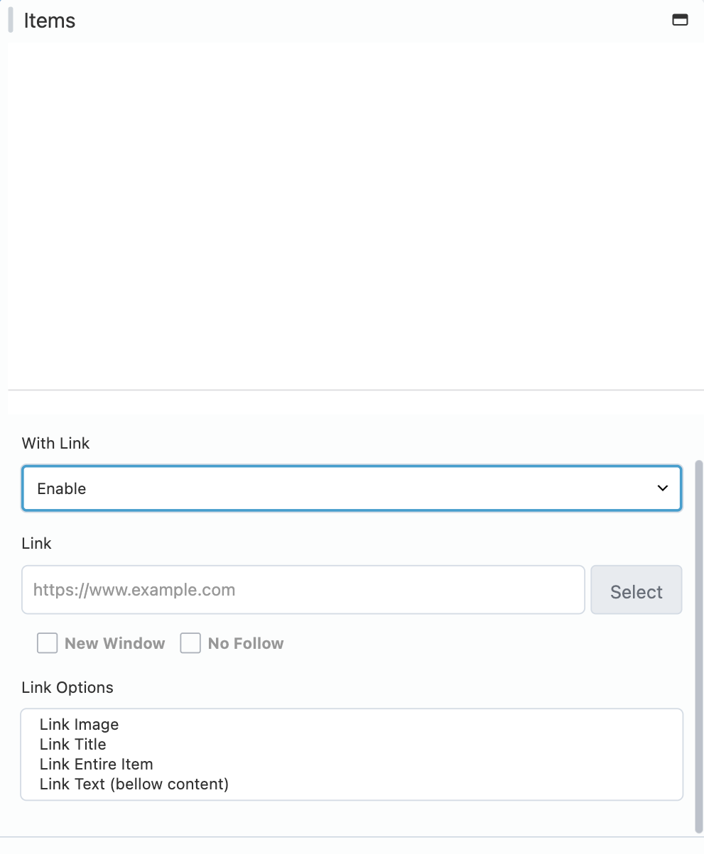
| Link option | Effect |
|---|---|
| Link Image | Wraps just the image in the link. |
| Link Title | Wraps just the title (Label) in the link. |
| Link Entire Item | Wraps the whole slide in the link — takes priority over the other three options if selected. |
| Link Text (labeled "bellow content") | Adds a separate "read more"-style link below the content, using the text you type into Link Text. |
You can combine Link Image + Link Title + Link Text, for example, to make several parts of one slide independently clickable — just don't combine any of them with Link Entire Item, since that one already wraps everything.
7.3 Item type: custom HTML
Switching an item's Type to Custom HTML replaces the built-in layout with a code editor where you can write your own markup for that one slide.
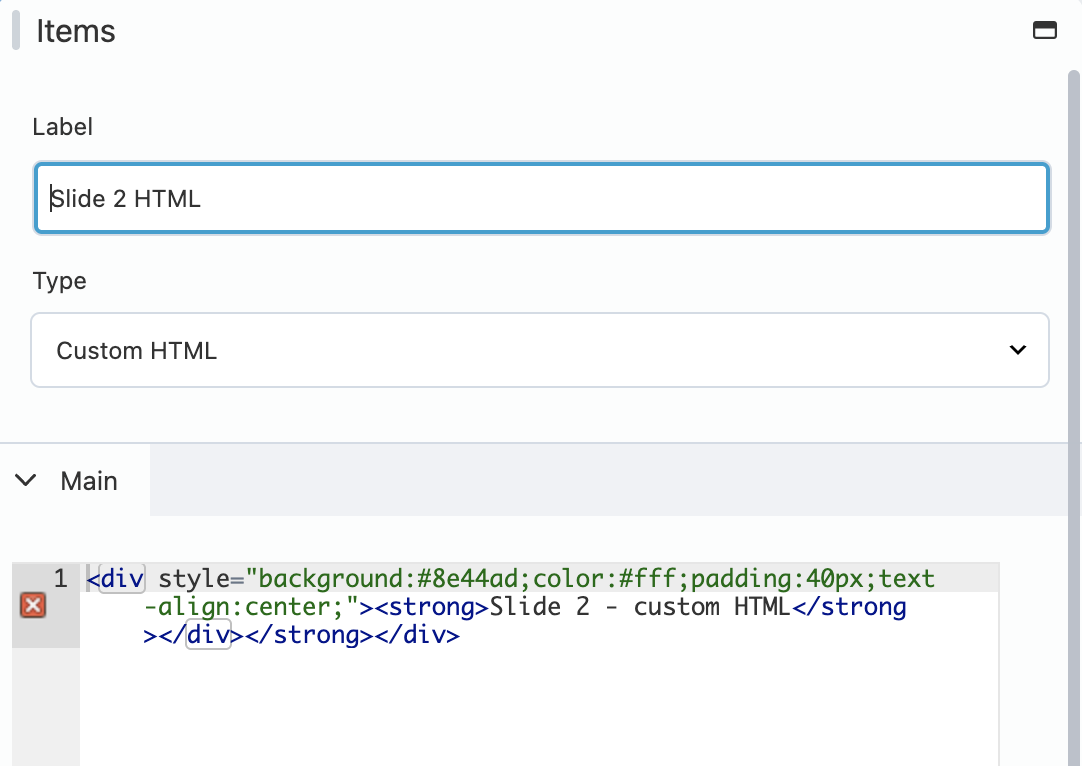
This is useful for a one-off slide that doesn't fit the standard image/content/link layout — a styled call-to-action, an embedded form, or hand-crafted markup for a specific design need.
The HTML you enter here is passed through WordPress's wp_kses() sanitizer before being displayed, using the same allowed-tags list as a normal post. <script> tags and other disallowed markup will be stripped — this protects your site even if someone with lower-level publishing access edits this field.
7.4 Item type: shortcode
Switching an item's Type to Shortcode lets a single slide be generated by any WordPress shortcode — yours, or one that comes from another plugin.
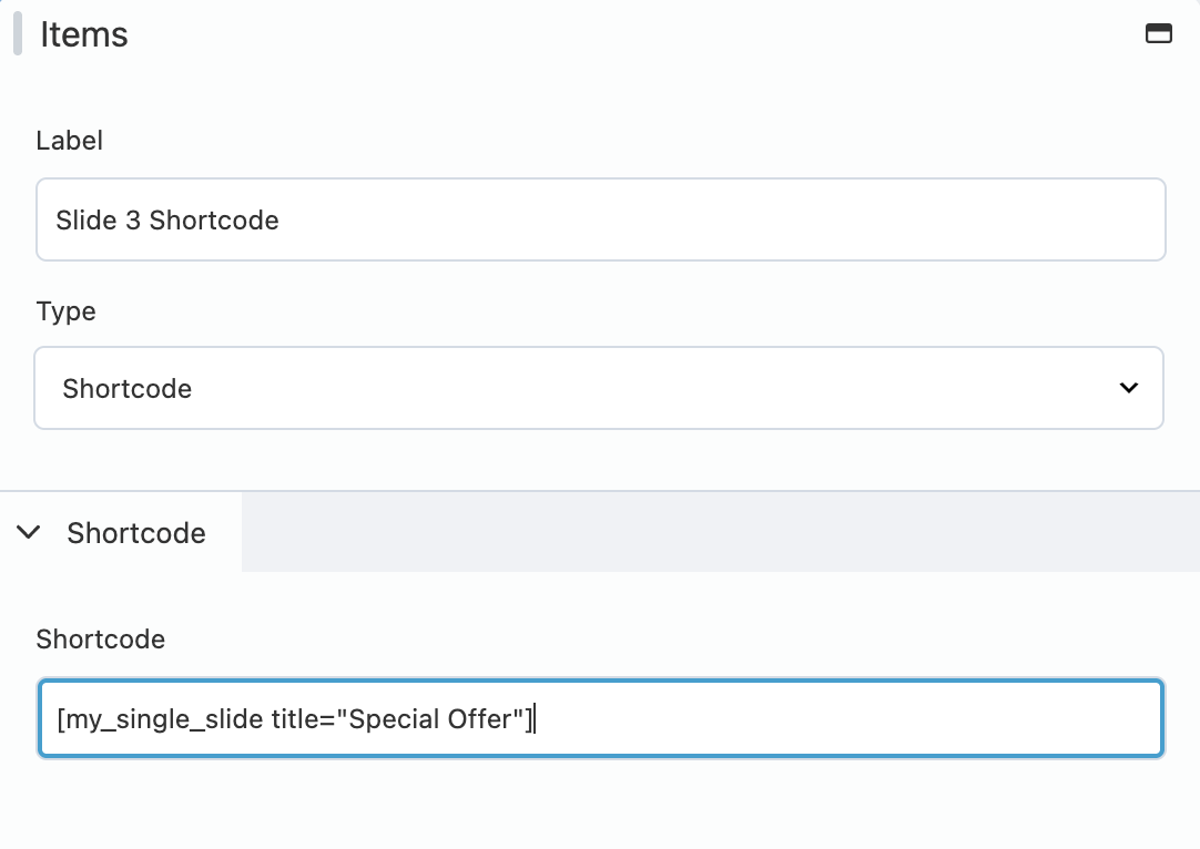
Just type the shortcode exactly as you'd use it in a post, including any attributes, e.g. [my_single_slide title="Special Offer"]
8Using shortcodes to populate the carousel
Both the module-level Items Type: Shortcode and the item-level Type: Shortcode work the same way under the hood — the plugin runs your shortcode through WordPress's do_shortcode() and drops the result straight into the carousel. The difference is only in how much of the carousel that shortcode is responsible for:
| Where you use it | Your shortcode should output |
|---|---|
| Items Type: Shortcode (module-level) | All of the slide markup — one <div class="nubocodeer-bb-carousel__item">...</div> (or equivalent) per slide, back to back. |
| Item Type: Shortcode (single item) | Just the markup for that one slide — the plugin already wraps it appropriately. |
The nubocodeer-bb-carousel__item class name above is spelled exactly as shown, with the extra "e" — that's the real class name this plugin's own templates use internally, not a typo.
Example 1 — module-level, populating the whole carousel from your latest posts. Add this to your theme's functions.php or a small custom plugin:
add_shortcode( 'my_custom_slides', function () {
    $out = '';
    $posts = get_posts( array( 'numberposts' => 5 ) );

    foreach ( $posts as $post ) {
        $out .= '<div class="nubocodeer-bb-carousel__item">';
        $out .= '<h3>' . esc_html( get_the_title( $post ) ) . '</h3>';
        $out .= '</div>';
    }

    return $out;
} );
Then on the Items tab, set Items Type to Shortcode and enter [my_custom_slides]. Now the carousel always reflects your latest 5 posts, with no manual editing required when new content is published.
Example 2 — item-level, generating a single slide with an attribute. This matches the [my_single_slide title="Special Offer"] example above:
add_shortcode( 'my_single_slide', function ( $atts ) {
    $atts = shortcode_atts( array( 'title' => '' ), $atts );

    return '<div style="padding:40px;text-align:center;">'
        . '<h3>' . esc_html( $atts['title'] ) . '</h3>'
        . '</div>';
} );
Here you don't need to wrap the output in nubocodeer-bb-carousel__item yourself — since this shortcode is attached to a single item, not the module-level Items Type, the plugin already provides that wrapper.
9Putting it all together
Here's the front-end result of the exact carousel used for the screenshots throughout this guide: three items — one Default, one Custom HTML, and one Shortcode — with Center Mode and Dots both enabled.

Notice how the centered slide (the purple Custom HTML one) is flanked by a partial glimpse of the next slide — that's Center Mode + Center Padding at work, and the two dots underneath come from the Dots setting and the item count.
10Tips & best practices
- Use Slides To Show + Slides To Scroll together. For a "one card moves at a time" feel with several cards visible, set Slides To Show to however many should be visible, and leave Slides To Scroll at 1.
- Center Mode wants an odd number. If slides look off-center, double check Slides To Show is odd (1, 3, 5…).
- Prefer Fade for single-image heroes. If you only ever show one slide at a time, enabling Fade often looks smoother than a horizontal slide.
- Use breakpoints instead of duplicating modules. Rather than building separate carousels for desktop and mobile, use one module and override settings per breakpoint in the Responsive tab.
- The settings panel only updates on Save. As of version 1.0.5, editing a field no longer live-reloads the carousel while you type — the preview refreshes once you click Save, which keeps the editor responsive even with many items.
- Saving one Carousel won't disturb others. If you have multiple Carousel modules on the same page, saving one no longer reinitializes the others.
11Troubleshooting & FAQ
Check Items Type on the Items tab. If it’s set to Shortcode, make sure the shortcode you entered actually exists and is spelled correctly — a misspelled or unregistered shortcode simply renders nothing.
The Custom HTML field is sanitized with the same rules WordPress applies to normal post content. If you need a tag or attribute that gets stripped, use a Shortcode item instead and generate the markup from PHP, where you have full control over sanitization.
Make sure Slides To Show is an odd number, and that Center Padding isn’t set to 0.
Double-check Unslick is set to False for that breakpoint — when it’s True, the entire Setup section (and therefore all its settings) is ignored, and the carousel is disabled outright at that width.
This was fixed in version 1.0.5. Update the plugin if you’re still seeing this.
12Changelog highlights
1.0.5
- The settings panel no longer live-reloads the carousel on every keystroke — it updates once, on Save.
- Saving one Carousel module no longer reinitializes every other Carousel on the same page.
- Hardened the module's front-end script output against malformed settings values.
- Fixed the Center Padding unit (px/%) being ignored on the front end.
- Updated the bundled Slick Carousel library.
- Verified compatibility with Beaver Builder up to 2.11.1.
1.0.4 and earlier
See README.txt inside the plugin folder for the full history.
13Support
For questions or custom requirements, contact the plugin's author at zed.1985@gmail.com.
Need something built on top of this?
If you need this module extended, a bug fixed fast, or a completely custom Beaver Builder module built for your project, I'm available for that work.
Tell me about your project.
I respond and manage projects autonomously within one business day. If we're a fit, we'll book a 30-minute call to go deeper.
Email me directly
A short note about your project, your timeline, and what success looks like. The more context, the better.
cesar@cesarsiancas.com Already know what you want?Book a 30-min call
Skip the back-and-forth. Pick a slot in my calendar and we'll talk through scope, timeline, and budget.
calendly.com/zed-1985/30min Hiring through a platform?Find me on Toptal
I'm a vetted Top 3% engineer on Toptal. If your company already has a contract there, we can start within days.
toptal.com/resume/cesar-siancas